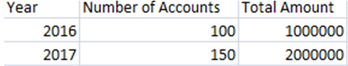
Say, your data is
You want to make a chart like this

If you select your
data and from insert menu select a line chart type, your chart will looks like
this

Solution:
Right click the
chart.In the pop-up menu Choose ‘Select Data’.
The following dialogbox appears:

In the dialogbox, click ‘Sereies 1’, then click edit. The following dialogbox appears:

Click in the ‘Sereies name’ box, then click on ‘Number of Accounts ’.
Click the arrow next to the ‘Sereies
values’ box, then select values in the ‘Number of Accounts’ column like this:

Click OK.
Click in the ‘Sereies
name’ box, then click on ‘Total Amount ’.
Click the arrow next to the ‘Sereies
values’ box, then select values in the ‘Total Amount’ column.
Click OK.
Now click on ’Edit’ under ‘Horizontal (Category) Axis Labels’.
Select the data in ‘Year’ column (i.e., 2016, 2017).
Click OK.
Now the chart looks like:
Click on the line
representing ‘Series 1’.

Select Chart Tools>Format Format Selection:

Following dialogbox
will appear.

Click ‘Series Options (if not selected).
Check ‘Secondary Axis’ radio button.
Click close.
If needed, choose display options under ‘Layout’ tab in the ‘Chart Tools’.
Continue visiting my blog for useful tips and solutions.
Please contact ExcelAccessHelp@gmail.com for consultancy on EXCEL and ACCESS.


No comments:
Post a Comment